CTA Creation Strategy to Increase Clicks Without Dropping Traffic

Call-to-Actions (or CTAs) reel in and turn readers into customers. However, simply inserting a square with “Click Here” text is not going to cut it.

What is even more surprising is that, according to a 2013 Small Business Trends survey, 70% out of the 200 smalls businesses (with 100 employees or less) polled did not have a CTA on their homepage.

Find out why you need to incorporate CTAs in your marketing strategy, plus small adjustments you can make to boost your CTA creation strategy.

But First, What Is a Call-to-Action (CTA)?

In a nutshell, a CTA is a button on a webpage that incentivizes readers to do something. Think of it as a non-monetary business transaction—a give and take, so to speak, between the reader and company.

This could be subscribing to a company newsletter to get the latest information in the industry or a free PDF or product in exchange for the reader’s email address. In other words, it is a win-win.

Where Should CTAs Be?

If you only decide on placing a CTA on one page, do it on your homepage. That way, you instruct the reader what to do. If not, you risk readers pulling a “skim and leave”—which can affect bounce rates.

Ideally, you should have a CTA on every page. However not every CTA has to be the same; it comes down to what you want the reader to get from the page.

For instance, on the service page, do you want the reader to demo the service? Or would you rather have the reader contact you for a quote? Or what about going to the pricing page to learn more about the different packages your company offers?


Photo by Benjamin Dada on Unsplash

CTAs and Pop-Up Ads

According to a Search Engine Land article, the new Google Chrome browser will block all pop-up ads in the upcoming year.

The reason being, Search Engine Land states, is that Google wants to provide users the best customer experience possible, with a Hubspot survey indicating that right now this is not the case; 73% of users polled admitted to disliking pop-up ads.

What this means is that CTAs on pop-up ads (annoyingly?) inciting readers to subscribe or purchase said product or service may be a thing of the past. If anything, thanks to Google’s changes, you can expect to see less of them.

But does this mean you should insert pop-up ads (with CTAs) on your company website? As the survey and the future change in Google Chrome’s browser show, maybe not.

Nonetheless, a study (by marketing automation company, Sumo) analyzed roughly 1.75 million pop-up ads, with the top 10 pop-up ads bringing in a 9.28% conversion rate.

2 Ways to Increase Your CTA Creation Strategy

Pop-Up ads or no pop-up ads, CTAs will continue to be an important part of your marketing strategy. To make your CTAS more attractive to your readers, find out easy adjustments you can make, suggested by a web-design expert Lilo:

1. Color Matters… When You Consider Who Your Target Audience Is

There is a common misconception that each color gives a specific impression. For instance, red is passionate, blue is calming, and green is neutral…

Still, color is important… but it is not as “black and white” (pun intended). According to Expresstext, the “right color” pinpoints the consumer’s reaction and how they perceive it in relation to the company’s brand.

Take brown, for example, which would not work with a women’s clothing company. But, as Entrepreneur points out, would be appropriate for a camping company, as brown (in this case) denotes ruggedness.

Photo by Anna Jiménez Calaf on Unsplash

Cultural Differences on Color

Then again, you have to consider your target audience: What is their culture? What are their experiences? Are they men, women, or both?

For instance, in the US pink would not be appropriate for a professional men’s football team. The reason being comes down to American’s impression that pink is more feminine and should be for girls, while blue is more masculine, and should then be for boys (while ironically in the past, it was the opposite).

According to The Japan Times, Japan is obsessed with the color pink, connecting it to the cherry blossom—Japan’s unofficial flower.

Unlike the US, in Japan, it is perfectly appropriate for a professional men’s football team to wear pink jerseys. In fact, Cerezo Osaka, a professional Japanese men’s team, does.

Gender Differences in Color

And then there’s gender. Entrepreneur goes so far to state that, while men and women both like blue the best, in general, women like colors that have shades of white in them. Men, on the other hand, like colors with shades of black.

How Does Culture and Gender Relate to Your CTA Creation Strategy?

Knowing your target audience’s culture and gender will help determine what color(s) to make your CTAs.

Perhaps a company with a demographic base of Japanese men could consider dark pink CTAs? While a camping company that has a target audience of American women may go with light powdery brown?

At the same time, it is important to factor in the colors of the logo and on the website. The first company may not want dark pink CTAs if their logo and company website has several shades of pink. Which brings us to…

Contrast, Contrast, Contrast

No matter what color you choose, it needs to contrast against the rest of your website. You want it to stick out so your readers have an easy time seeing (and clicking) on it.

Photo by Glenn Carstens-Peters on Unsplash

2. Make the CTA Specific and Reader-Friendly

How does the reader benefit by clicking on your CTA? What do you want the CTA to accomplish? In answering these questions, you can figure out what the CTA message should be.

Also, aim for a big font. (This goes for text in general). A 1929 study indicated that people had the easiest reading 12-point font. (Of course, this was for non-digital text). Nowadays, that number (especially when it comes to digital print) is bigger.

Final Thoughts

It is crucial to having CTAs on your company website; they help conversion rates and increase profits. Have any more CTA creation strategy tips? Leave a comment.  

Read More
Via.Vision Via.Vision June 1, 2019 0 Comments

Have you ever wondered what sort exposure an old email might have?

Information Gathering

  • Have you ever wondered what sort exposure an old email might have?
  • Perhaps an employee, old or new, is using Facebook to discuss sensitive business information?
  • Or maybe your just curious about your digital footprint across the internet?

We’ve got you covered! by using the latest open source techniques, methodology and software, with just a few pieces of identifiable information were able to offer you a complete picture. From correlations with forgotten accounts, to places you’ve forgotten you used. it’s always worth knowing.

Network Penetration Test

With network security being an over looked issue among many businesses, it’s often the golden bullet for malicious attackers. when everything from Wi-Fi to physical network devices can be incorrectly configured, it’s hard to ignore the chills.

That is why having an all in one place information management system is good for business’ in keeping information secure.

We provide peace of mind, either at home, on site or anywhere else of your choosing. We’ll figure out your weak spots, patch them up, and away you go!

Read More
Via.Vision Via.Vision May 20, 2019 0 Comments

6 Ways To Boost Your Opt-Ins and Build A Strong Subscriber List

When it comes to getting your brand out there in the know, nothing beats email marketing.

According to Toronto lead generation experts – An email list for your business is a very powerful asset in today’s online marketplace. Every effort must be attempted to ensure that you can create and maintain a healthy list of your own, and that people keep on opting-in, so your list grows over time.”

There is also one thing you need to expect with email marketing – and that is not everybody achieves spectacular growth. Email marketing can sometimes be perceived as spam, and if implemented incorrectly, it can destroy the business-customer relationship you have worked so hard to nurture.

Many experts such as youthnoise.com preach about the best and most acceptable practices like sending your email on time, writing a compelling email subject and using personalization to make the email more special to the recipient.

Aside from these techniques, there are also other concepts that you can adopt to get more people to opt-in to your list. Here are some of the best tips to entice more users and drive up your conversion rate.

Provide Social Proof

When you are trying to push and grow your email list, there are many strategies you can try. But one of the factors that can guarantee you a strong list is to provide social proof.

This type of content will move people to opt-in. Using client testimonials, customer reviews, case studies and other proofs about your service or product, you can show your visitors that subscribing to your site will be of tangible value for them.

Amazing Content Is Your Foundation

You hear the words “Content is King” everywhere. This also applies to your emails.

Strategize well and pay attention to every detail when crafting your email messages. Many experts stand by to the fact that teaching what the users want to know instead of selling a product immediately will build more trust. You must learn some storytelling skills for a perfect message that is tailored to fit your target audience.

Use Three (3) Opt-Ins

Naturally, opt-ins are found at the very end of your post. However, it has been recommended that you should have a total number of three to truly maximize your chance of success.

Do not just rely on your pop-ups, insert them in your content as well. Often time, after the visitors close your pop-ups, they later find your content pretty interesting. Shortly thereafter, they would subscribe to your newsletter if the opportunity was presented to them. To provide convenience, your visitors should find an alternative opt-in form to subscribe to.

Test The Best Placements

You get different users each time. But if you continue to study and investigate your site and study your visitors with a heat map for example, you will soon find the best placement for your opt-ins. It could be a popup email form, it could be underneath your blog posts, or it could also be at the sidebar, or even in the middle of some posts.

If you think there are other placements that would work, do not be afraid to experiment. Just remember, the point is not to bully your visitors with annoying opt-ins, it is to keep them hooked.

Adapt for Mobile Use

Though your website content and the message you convey are the most important factor in converting a new visitor to possibly a regular customer, you may also want to make sure that you provide them with the ideal opt-in and email reading experience.

Remember, many people access the internet using their mobile devices. If you do not optimize your website for mobile use, your visitors may not be too happy about what they see from their phone. To be fully effective, always test your opt-ins to ensure that email messages are usable on a smartphone device.

Keep Your Subscribers

Getting people to opt-in is actually half the battle. Making them stay in your list and turn them into valuable assets for the future is another obstacle to overcome. You have to take the necessary yet appropriate actions like sending fewer emails and customizing the content and making it more personal, with innovative and entertaining ideas.

People are receiving dozens of emails every day. Apart from personalizing your emails, sending too many can cause a nuisance and this will make them feel uncomfortable. As a natural reaction, they will unsubscribe. So think twice before you click the send button.

What makes email marketing so precious is that it can be used anytime. Whether your business has taken off, or you decided to close it down to create another one, you own the rights to your list and you can email these subscribers anytime you wish. Take these suggestions above and allow your list to grow for your online success.

Read More
Via.Vision Via.Vision April 7, 2019 0 Comments

Finding Website Design Inspiration

As a website designer, every project is unique. In fact, as a professional, you are regularly expected to provide something better than your previous effort. With the market becoming extremely competitive, creativity is always a bit part of this job. The worst moment happen when that imaginative spark required to start off a project goes missing. Still, there are many places such as this page where you can draw some inspiration. Apart from that, there are other premium websites where you get lots of inspiration to build a classic website and web design companies such as Absolute Summit has great templates on their site. We’ve put together a list of some of the best sites to find website design inspiration for you below:

(Don’t forget that in order to rank these websites you will need SEO, check seo bournemouth services for more information)

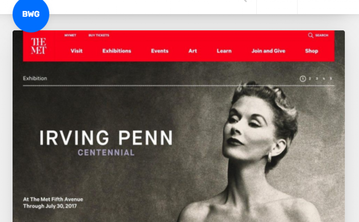
  1. Best Website Gallery (BWG)

The website which is managed by David Hellmann is a unique meeting place for web design inspiration. If you’re developing a premium website, this is the perfect site to visit whenever you need to unlock your power of imagination.  Although the website was start in 2008, it has grown to be relied on by millions of web designers across the world looking for inspiration. What makes it popular is accessibility of information. BWG uses a robust tagging system that makes it very easy for the user to find inspiration based on the functionality, style and design approach. With more the 2,000 top quality website to peruse, this is indeed a great place to visit.

  1. CSS Nectar

Apart from incredible inspiration, this is one of the most user-friendly websites to visit. CSS Nectar is one websites that makes the finding web design information for specific sites very easy. With its tags and filters, you can easily find inspiration based on category, colour tags, feature, and country. What makes CSS Nectar popular and attractive designers is the triple-vetted content. First, the user is required to pay a fee to submit a website for review. This is meant to prove that people are confident with the website. Second, the submission is reviewed and finally, it is voted by the community. This system gives the sites feedback so it’s easy to see what people like and don’t like about the digital art and design of each site.

  1. Abduzeedo

The website whose name simply means “abducted” in Portuguese, is about a decade old. Over the years, it has helped hundreds of web designers. What has made it popular among designers and creative professionals is its regular updates. There is always something new for the users to see. The website boasts of having an array of inspirations regardless of the website that you are creating. You’ll be impressed by the quality of information that the website has. A visit to this site will help in triggering your imagination with brilliant ideas. Apart from digital design inspiration, the website also offers other inspirations such as photography and architecture.

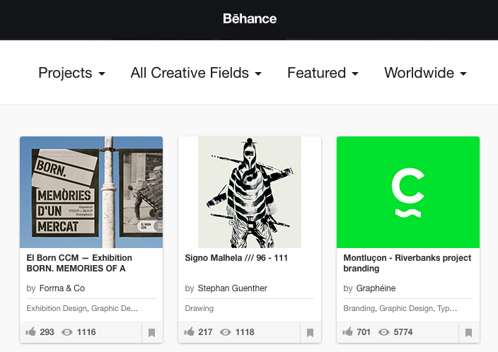
  1. Behance- Discover

Visit this website and you will find massive amount of website design inspiration from their creative community. It is very easy to locate the design you are looking for by either looking for popularity, location and timeframe. For instance, you can search for the “most appreciated web design in Brisbane, Australia”. The fact that it’s part of the adobe family of companies, its’ probably the world’s most active creative community. Its detailed filtering options make it one of the most visited sites by web designers

and creative professionals. Try it and it will unlock your creativity in a great way.

  1. Awwwards

The website provides a unique place for web designers to draw inspiration. The website is managed by a group of international creative who rewards those that submit the highest quality of design. This is what makes the quality of inspiration from this website incredibly high. The jury that awards the best site ideas is hand-picked to ensure that quality is maintained. Apart from the website looking pretty, they also consider other factors like creativity, content, usability and site design. Awwwards has one of the most robust tagging that makes it easy for the users to find the inspiration they are looking for.

  1. Designinspiration

If you are stuck with a web designing project, try this website and experience the magic. Created in 2010, the website has been home to many web designers worldwide. The site provides a perfect place where web designers can discover and share information. The site curates and maintains only high-quality content. It’s a user-friendly website and you can easily search information by topic tags or colour. The site also allows the user to organise and save things that they like on the page.

Read More
Via.Vision Via.Vision March 12, 2019 0 Comments

Understanding Binary Numbers

Because Why Not?

People tend to generally shy away from binary. As if there’s some automatic reaction to think only a math loving or crazy genius would even attempt to play with such an arcane form of a number system. Because that’s it ladies and gentleman, it is quite literally just another number system.

Do you remember when you were first taught your numbers from 1 – 10, probably not right? But you did. How about when it came to using these numbers in a constructed sort of manner alongside;

multiplication, addition, subtraction & devision

All of a sudden things started happening, objects could be quantified, time could be read and yet we were all still late for school! Lets dive in a little further and dispel this myth shall we?

So lets take 1 and 0, I personally like to think of it as either ‘ON : OFF‘ or ‘Alive : Dead‘. But you’re free to attribute as you wish! Moving on to the binary number;

10101101  = 173

What do you make of it? Exactly! It’s obviously 173. I mean how can anyone not see that, it’s as clear as day!

It turns out that while we were learning one way to count, we never ended up learning all the others. “Wait, don’t computers use numbers? Stop with your jibber jabber!”. Is what you could be thinking, and don’t you worry, you’re right. They’re just represented differently to the CPU’s, for performance and logistical reasons as well as hand full of other reasons I wont go into.

Below you’ll find different CPU’s architectures, alongside their integer specifications;

16 bit

  • Signed:  -32,768 (-1 x 215) through 32,767 (215 – 1)
  • Unsigned: 0 to 65,535 (216 – 1)

32 bit

  • Signed: -2,147,483,648 (-1 × 231) through 2,147,483,647 (231 – 1)
  • Unsigned: 0 to 4,294,967,295 (232 – 1)

64 bit

  • Signed: -9,223,372,036,854,775,808 (2^63) through 9,223,372,036,854,775,807 (2^63 − 1)
  • Unsigned: 0 to 18,446,744,073,709,551,615 (264 − 1

hello world: 01101000 01100101 01101100 01101100 01101111 00100000 01110111 01101111 01110010 01101100 01100100 – Click Here to test binary!

Read More
Via.Vision Via.Vision February 1, 2019 0 Comments